
We are sharing our school reopen journey. You can view our other blog posts here.
After months of New York serving as the epicenter of the COVID-19 pandemic, in June, we flattened the curve and reached a 1% positive COVID-19 infection rate over a 7-day rolling average, which has held steady for over two months now.
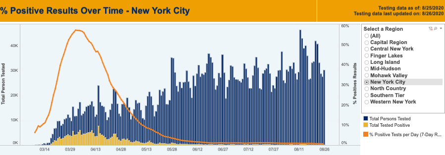
(See current data published by New York State here and New York City here.) Hospital ICUs are no longer packed with COVID-19 cases, and emergency sirens no longer wail outside all day and night. Now, in New York, you can dine outdoors at restaurants, get your hair cut and nails done, go to the Bronx Zoo, and even go bowling (at reduced capacity and with masking and social distancing rules in place). These are the dog days of a NYC summer not quite like any other, but we are grateful for where we are today nonetheless.
What does all of this mean for us in the context of school reopen where we will start to convene hundreds of individuals again in our schools? We’ve grappled deeply with this question, and have turned to data and science to help us understand. We are not infectious disease specialists, medical professionals, or public health experts, and we cannot claim to have the data completely figured out. However, we have made it our mission to understand what we can about the data, as it informs when and how we open our schools.
Making Sense of 5%, 9%, and 3% COVID-Positive School Reopen Thresholds
New York Governor Cuomo set a positive COVID-19 testing rate threshold of below 5% for school reopen. What this means is that, of the people taking COVID-19 tests in New York, if 5% or fewer tested positive on a 14-day rolling average and the region reached phase four, the region’s schools would be allowed to reopen. The governor further stated that schools would close again if New York exceeded a 9% positive infection rate on a 7-day average. New York City’s Mayor de Blasio set a stricter standard and said that NYC DOE schools would close again if NYC reached a 3% positive infection rate on a 7-day average.
In New York City, based on data reported by New York State, the number tested since June 15 has ranged from 20,000 to 45,000 individuals daily, and the rolling 7-day average positive testing rate has remained around 1% for this entire time.
We did it! We are well below 5%, 9%, 3%, whichever threshold you choose, and on August 7, Governor Cuomo announced that schools across the state would be allowed to reopen. So why isn’t everyone racing to reopen schools? I suspect this is in great part because we don’t understand what the data really means! First, it is very difficult in the chaos of the current politics and frenetic news cycles to find anything reliable on positive infection rates that would give one any true comfort, even at a 1% positive testing rate level. Second, the data itself is confusing: New York State and New York City both report data for New York City, but their daily positive test rates are different from one another (we understand this is because the city reports positive tests on the date the test was performed, while the state reports positive tests on the day the result was reported to the state—we track both data sets). Creating further confusion, various news outlets and public officials occasionally report conflicting data points that cannot be easily reconciled with the public data from the state or the city. Third, if one finds anything that seems reliable, it seems to be written in “medical speak” or “science speak” caveated in a hundred ways, and ultimately either indecipherable to the average person or caveated out of practical use.
We have been fortunate to have had the opportunity to talk with some smart medical/public health experts who have graciously translated some of the medical/science speak for us. (Thank you to David Noah and to Charter School Growth Fund and NewSchools Venture Fund, who facilitated key conversations between charter schools and two brilliant medical experts.) Following these conversations, which provided greater insight into how to understand the various data points, I have arrived at the conclusion that the relevant data indicates that it is time for us to reopen. So how do we look at the data?
Understanding COVID-Positive Testing Rates and R Spread Trend Rates
As mentioned above, I am not a medical expert, but this is my layman’s understanding, which I offer as one person’s perspective after reading all that I can and talking to individuals much more knowledgeable in this area than I. I understand that positive COVID-19 testing rates can be trusted as a smart indicator because they are presumably capturing the population of people who are symptomatic or may have had exposure to COVID-19. But the reliability of this indicator is only strong if testing is widely available, which will likely be reflected in significant numbers of individuals within a community tested daily. You can conduct your own anecdotal evaluation of how reliable your locality’s positive COVID-19 testing rates are by whether you are able to obtain free COVID-19 testing without hassle (quick and easy to get with no hoop jumping). If the availability of testing is limited, there is good reason to question the reliability of current positive COVID-19 testing rate data. Unfortunately, even the availability of COVID-19 testing has become a political matter, which understandably rattles public confidence in the possibility of safe school reopening.
The problem with COVID-19 positive testing rates is that the data is lagging. It is a snapshot in a moment of time in the past. It doesn’t really tell us as much as we would want to know about tomorrow, especially given the fast ability of COVID-19 to spread. The data’s usefulness further declines if there is a significant delay in obtaining test results. However, just because the data is lagging doesn’t mean that it is irrelevant; it’s just incomplete. We also need some data that tells us about future trends so we can predict what will happen tomorrow.
We look daily at positive COVID-19 testing rates in NYC, Bronx, and Manhattan, where our schools are located, as well as the zip codes where our schools are located, and we also look daily at something called R, which represents a disease’s effective transmission rate. R is a pretty neat mathematically calculated value that estimates the number of people that one infected person can infect. If R is greater than or equal to 1.0, the infection will spread exponentially. If R is less than 1, the infection will spread slowly and eventually die out. R can be obtained from rt.live. (You may see references to R value, Rt, and R0 (“R naught”); our understanding is that R and Rt are interchangeable, whereas R0 is a slightly different value that does not consider differences in localities. See here for more information.)
Our Daily COVID-19 Data Dashboard
My daily dose of COVID-19 data comes across my email like this (this email shows data from yesterday, 8/26; the email also links to a spreadsheet where we track this information historically, as well as the sources of each data point):
City-wide Positive Testing Data: As of 8/24, for NYC, NYS reported 1% 7-day rolling average of % positive tests, and as of 8/24, NYC reported 1.0% 7-day rolling average of % positive tests.
- New York State Data:
- 8/24 – 27,406 people in NYC were tested, and 231 tested positive, a daily positive rate of 0.8%
- 8/24 – 7-day rolling average of % positive NYC: 1%
- New York City Data:
- 8/24 – 1.0% tested positive
- 8/24 – 7-day rolling average of % positive NYC: 1.0%
* Discrepancies between the rates reported by NYC and NYS are a result of different reporting protocols: NYC reports case data on the day that the test was taken, whereas NYS reports case data on the day that the result was reported to the state.
Borough Positive Testing Data: As of 9/24, the 7-day rolling average of % positive tests was 1.1% in the Bronx and 0.5% in Manhattan.
- Bronx:
- 8/24 – Bronx daily % Positive: 0.6%
- 8/24 – 7-day rolling average of % positive Bronx: 1.1%
- Manhattan:
- 8/24 – Manhattan daily % Positive: 0.5%
- 8/24 – 7-day rolling average of % positive Manhattan: 0.5%
Zip Code Positive Data:
- 10454 (Bronx)
- 4-week rolling average of % positive: 1.96%
- 10033 (Inwood 187th)
- 4-week rolling average of % positive: 1.53%
- 10031 (Inwood 138th)
- 4-week rolling average of % positive: 1.45%
R0: R0 is currently below 1.0 in NYS, Bronx, and Manhattan.
- New York State:
- Daily R0 of NY State: 8/26 = 0.95
- Bronx:
- R0 Bronx: 8/17 = 0.99
- Manhattan:
- R0 Manhattan: 8/17 = 0.92
What the above tells me is that the positive COVID-19 testing rate 7-day average in NYC is around 1%, which is very good (under the 3%, 5%, and 9% thresholds stated earlier), and the positive testing rates in our neighborhoods also remain below any of the thresholds. The R data tells me that the rates are likely to continue a downward trend. We have up-to-date R data for New York state, but have not found a public source for up-to-date R data for NYC. Over the last few days, the R in New York state has been below 1, which is excellent news since it indicates that COVID-19 is spreading slowly and on a potential path to dying out in New York (although there is always the possibility of a resurgence). We have found R data for NYC’s boroughs, but, as you can see in the above snapshot, the data is time-lagged by at least several days, which makes it far less helpful. I do not know why R cannot be published in real time for NYC’s boroughs; this seems like a big failing to me. In addition, the medical experts we consulted felt that what we really need for the safety of our communities is zip-code-level data, but there is limited availability of real-time zip-code-level data. NYC publishes zip-code-level data for positive case rates, which we track, but it lags significantly (it provides the 4-week average positive case rate). Additionally, zip-code-level R data is currently unavailable, at least publicly as far as we know.
(UPDATE AS OF 10/6/2020: The New York Times recently started publishing the number of positive cases in each zip code in the past 7 days (this is a count of all positive tests, rather than a percentage of people testing positive); we have started tracking this data as well as the data listed above, as it is the most real-time zip-code-level data we have found. Additionally, as case rates in New York City have increased in certain neighborhoods, we have begun tracking the zip code “hot spots” identified by Governor Cuomo and Mayor de Blasio (where the positive test rate exceeds 3%), as well as adjacent zip codes of concern (adjacent to hot spot zip codes but where case rates do not exceed 3%).)
Although NYC is its own beast, we also keep a general eye on New York state. On Wednesday, Governor Cuomo confirmed that New York State’s positive testing rates were below 1% for the 19th straight day in a row. This past Sunday, it was 0.66%, the lowest recorded figure since the pandemic started. (Compared to rates of 14.1% in Texas and 13.2% in Florida, New York has truly done a good job of flattening the curve.)
Time to Reopen Our Doors
Based on all of the above, we believe it is time to reopen our school doors, which we are doing this upcoming Monday. As I tell our staff, we are not opening at all costs; we are going to daily monitor the data to guide us on whether we proceed on day one or not, and whether we stay open. Because we still do not feel knowledgeable enough about the data, we are not locking ourselves in to a static data threshold for school closure (beyond the threshold set by the state, which we must and will follow). I don’t know what a 3%, 5%, or 9% positive COVID-19 testing rate looks like for us; for all we know, it could be clustered on Staten Island, which could be very different than in the Bronx. Instead, for full or partial school closure decisions, we will monitor the data, trying to get smarter about the data as quickly as possible, and also respond to actual infections that may happen within our school community.
We are sharing our learnings and experiences in hopes that we can be a source of concrete encouragement, learning, and support amidst tremendous noise as schools take the necessary steps toward safely reopening their doors. Our last post covering Zeta’s COVID-19 operational procedures is here. In our next post, we will cover our experience with failed promises and pledges by NYC’s Mayor and the NYC DOE Chancellor. Stay up to date with all of our blog posts by visiting here.